
Australian photographer extraordinaire Max Dupain said it best: “I’ve always believed a great photographer should concentrate more on depth of feeling and less on depth of field.”
It’s all about the feeling you will get from each photo you post and share. In today’s digital world, only carefully crafted and laid out pictures get the most hearts and likes on social media. Speaking of layouts, which one attracts more engagements?
There are big mobs of tips on how to come up with the best layout for your Instagram posts, but let’s sort them out and share with you the best ones. Let’s go.
Tiles layout
It’s classic, basic, and gives your feed the right kick. The rule for this layout to work is pretty simple: post one square at a time. Also, make sure that you stick to your brand’s colour palette. This means using a specific filter and/or tone consistently to develop your account’s overall feel.
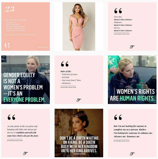
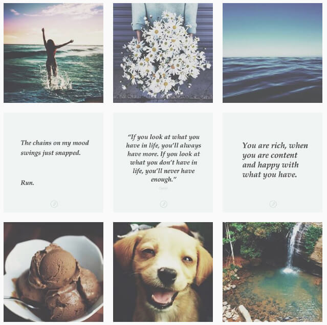
Checkerboard layout
To make your brand’s feed come across as interesting and engaging to your followers, try this layout. It’s basically posting a photo and then a quote. This layout gives your page the two-tone look that’s easy on the eyes. Checkerboard layout is usually used by Instagram influencers and brands that heavily depend on sharing quotes.
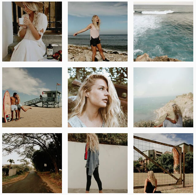
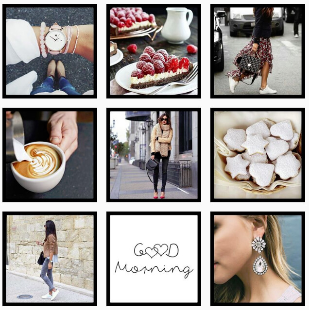
Row by row layout
The mantra of this layout is: it takes three to tango. This layout works by sharing three consecutive photos that share the same theme or story and visual aesthetic. It gives Instagrammers the illusion that they’re reading a magazine as they’ll view your photos from left to right.
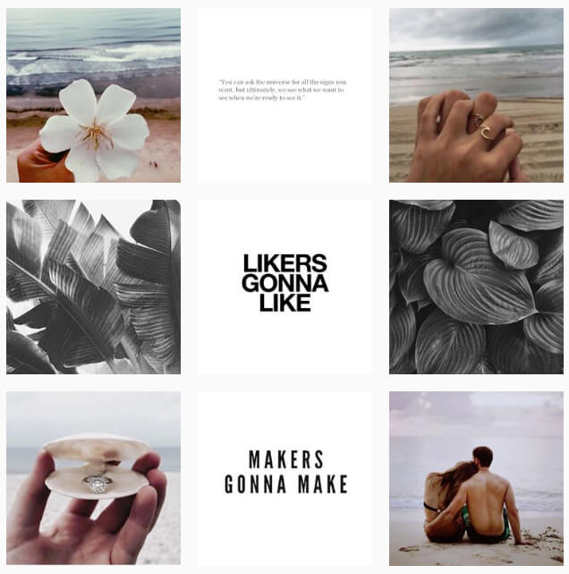
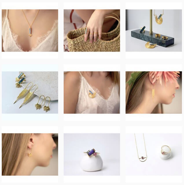
Vertical line layout
It’s like playing tic-tac-toe with your Instagram photos. This layout has been popular among influencers and young brands. To pull this off, post images with a consistent background in the middle of your feed, creating a vertical line appearance. The key is to have the photos with the same visual aesthetic and background colour.
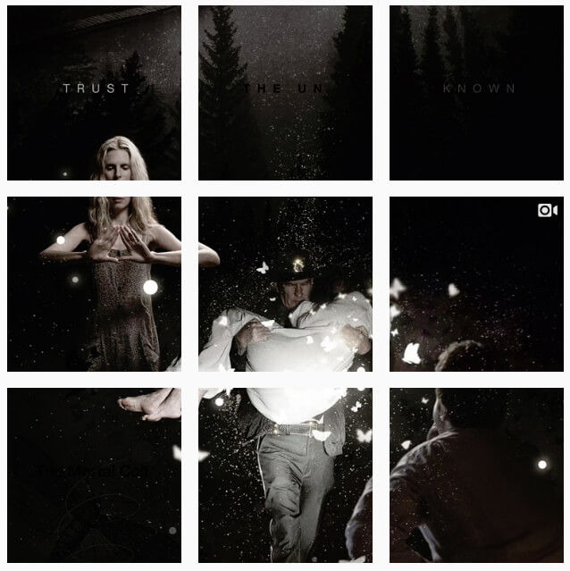
Puzzle layout
If you’ve been using Instagram for years now, you’re probably well aware of this layout. To pull this off, you need to slice an image into multiple ones. It might be difficult to create at first, but you can always use an app like 9square, 9 Cut or Canva. The real challenge though is that each photo has to look interesting to get likes and engagement.
Consistent border layout
To make your feed look more uniform, choose a colour for your photos’ borders and stick to it. If you’re going with white, use that colour for all your photos. Other than white, other popular border colours are black, gray, beige, and green leaf. Just make sure that the colour you pick speaks your brand’s identity.
Landscape layout
For your feed to stand out, you might want to go with this layout. Instead of using squared photos, posting rectangular images can make your page look unique and more interesting. However, just make sure that all your photos have the same visual aesthetic and feel.
A ripper Instagram feed isn’t so hard to pull off, right? Just think outside the box and stretch your creative muscles to create a visually appealing and interesting account.
Social Media Manager Marc Brauer and Social Media Coordinator Emma Woythaler are our experts who can help your business with paid and organic social management. If you’re after advice tailored to you or the full-time management of your social media profile, give us a call today and we can set you up with one of our social media specialists.